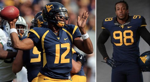
MORGANTOWN, W.Va. — ESPN’s Paul Lukas, imminently beloved and lovingly berated as the Uni Watch guy by legions of sports fans who actually know what a raised nose bumper is, began writing his uniform column in 1999, back when Oregon looked like this. He favors traditional unis (but recognizes modern-cool when he sees it) and detests purple (but defends K-State and TCU for staying true to school colors).
His knowledge of apparel always apparent, Lukas spoke with MetroNews about the redesigned togs West Virginia will don Saturday …
Out with the old: “I was not a fan of the previous West Virginia design with the swooping arches coming down the sides of the jersey. I didn’t like it when other schools started doing the same thing, (because) it wasn’t really like a proprietary West Virginia design. It was just a Nike design that they gave to a bunch of their schools. I like that the Mountaineers are going away from that.”
First take on WVU’s new threads? “Overall it’s a decent-looking uniform, and I think it’s an improvement over their previous uniform. You hope they don’t wear 27 different combinations in 27 different games, but in general it’s a solid-looking uniform.”
Perhaps tools shouldn’t become fonts: “As is the case with a lot of Nike designs, there are some details that make you roll your eyes a little bit. The numerals have these pointy little edges that are supposed to be like mining pickaxes. I appreciate they’re trying to create a storyline behind the design, but Nike tends to do that in ways that always seem like a bit of a stretch.”
A self-described “classicist” tolerates the spectrum of bad design that make his blog so popular: “If you’re constantly changing, you’re never going to have an iconic look. You’re never going to have a chance to establish an iconic look because you don’t really stand for anything. Oregon has made that work for them, because what they stand for is constant change. You expect to be surprised you expect them to come up with something crazy very week.”
Schools should embrace a consistent look, because they can’t out-Oregon Oregon: “For a lot of schools (constant changes) stands for ‘We don’t stand for anything,’ or ‘We’re just the flavor of the month, or ‘We just want you to buy a new jersey.’ It has less to do with experimentation than a short-attention span factor that we see throughout our culture … where everyone needs and becomes trained to expect a jolt of stimulation on a shorter time cycle. So teams used to change their uniforms once a generation, and then it became once every 10 years and then it was once every five years. Now it’s once a year or once a week.”
But five-star recruits demand this! “We do hear how recruits supposedly like all those changes, but for schools like Alabama, Texas or Auburn, I don’t notice them having trouble with recruiting despite sticking with their traditional look.”
Now, about that Maryland team WVU will face in Week 4 … “The lesson there is: If you dress like a clown and you win, you look like a winner. If you dress like a clown and you lose, you just look like a clown. And that’s kind of the situation Maryland finds itself in.”
Lukas released his Uni Watch college football preview column on Tuesday—the most engaging time-suck I and my coworkers have ever experienced. Just when we presumed to be well-fitted for the upcoming season, Lukas unveiled an addendum on Thursday, because every patch, decal and alternative mouthguard are important.
At the top of the post, check out the full audio of my chat with Lukas, during which he undresses North Carolina for the uniforms they debuted Thursday night.

